🦠 COVID-19 | Thoughts for New York and Boris| 🤕 1,214,913 | Deaths 65,626
I am a scientist by education, banker at JPMorgan for a few years, then mature PhD student in Chemical Biology at Oxford under the supervision of Christofer Schofield (FRS) and Peter Ratcliffe (Nobel laureate in medicine in 2019). Founder and tech investor focusing on media and education. I care about science, learning and Democracy which are good bedfellows.
📊 Daily Data Brief:
1,214,913 cumulative cases (+123,972)
Active cases: 895,617 (+91,190) (this is the number of currently infected patients)
Total Deaths: 65,626 (+7,117)
Serious/Critical Cases: 44,638 (+5,236)
Source: Worldometers
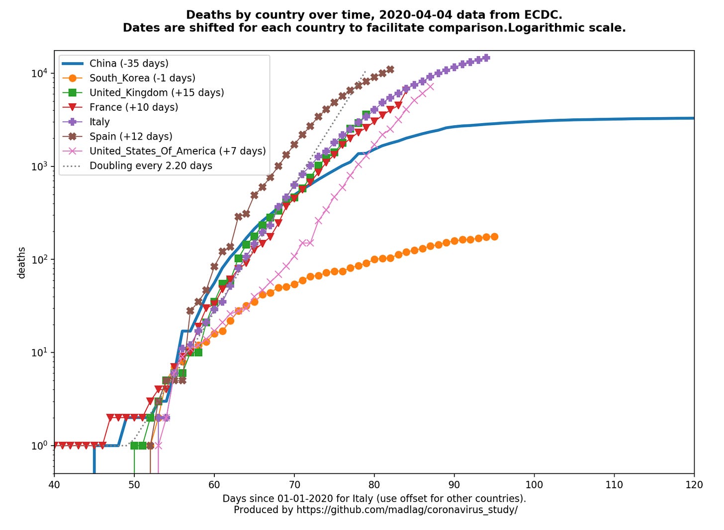
Death curves (updated daily as ECDC releases). Major update with per country graphs now available (Link)

A shorter summary and list of articles today. A great interview of world renowned Larry Brilliant (as well as his TED prize video from 2006) and articles on privacy in the age of coronavirus, fake news, supply chain chaos and enterprise resilience.
🦠 Video of the day: The Washington Post has published an animated infographic that shows how fast COVID19 has become the top cause of death in New York City. Chilling (Link)
🦠Article of the day: “How society can overcome covid-19” is a fascinating interview in The Economist of one of the world’s leading epidemiologist Larry Brilliant. Fascinating. I have also added his 2006 TED Prize acceptance speech below in the video section (Link)
🚔 NOYB (the European Privacy Charity founded by Max Schrems who took on Facebook in a landmark privacy case) writes “Data protection in times of coronavirus: not a question of if, but of how”. Rather than looking at whether specific provisions in GDPR on epidemics will be relied upon by EU governments to fight the epidemic, NOYB rather focuses on good Privacy by Design principles to gain the necessary trust of the public such as:
“good data encryption, storage of data within the user's phones and the publication of the source code ("open source").”
An informative read as tracing apps are coming. (Link)
FAKE❗️ COVID19 has exposed how broken our information ecology is and how disinformation has been a problem in this pandemic. The Fake History Hunter wrote “NOT a donkey being carried across a minefield” as a picture of a soldier with a donkey on his back was going viral and as people/government were not practicing physical distancing. The real story is actually that of compassion between a soldier of the Foreign Legion and baby donkey dying of hunger. A heartwarming story and a warning about the spread of fakes! (Link)
🚚 Russell Brandon writes “Tech supply chains are still a complete mess” for the Verge. Brandon starts with":
“Last week, we made the case that tech manufacturing was uniquely vulnerable to pandemic problems, from a combination of just-in-time manufacturing practices and a far-flung network of suppliers. But just a week later, the news is even worse.”
This weeks Brandon focuses on the supply chain of lithium (think batteries) which is in total disarray. And Apple is still trading only 26% down from its all time high…(Link)
🆕 John Hagel recently wrote “Viral Flows” contextualising to the COVID19 pandemic a number of his thoughts on how “to help individuals and institutions around the world to increase their impact in a rapidly changing world”. John has spent 40 years thinking and helping in these areas and was referencing in the above blog an article he wrote back in 2013 “A Contrarian View on Resilience”. This is very timely. In it, John describes how resilience has come to become associated to “bouncing back” as opposed to moving forward. He sees bouncing back as a distraction and instead he wants leaders in enterprise, public policy and NGOs to see building resilience differently:
“we will find ways to unleash more and more of our potential as individuals and institutions. Bouncing back will look more and more like the quaint nostalgia that we finally found the courage and conviction to overcome.”
A timely read, to harness the COVID19 shock as an opportunity for change. (Link)
📊 A picture is worth a thousand words: Global (🌎) and local (with relevant flag) visualisation and forecasting tool
🌍 NEW❗️ Google has published a new website to “See how your community is moving around differently due to COVID-19”. They have a lot of data to do so… (Link)
🌎The Financial Times has a data tracking page which is in front of the paywall, looking at cases and fatality curves for selective countries and metropolitan areas/region. It is not as extensive as the Madlag link below, where you can see static as well as animated images for a greater number of individual countries. (Link)🇺🇸The Institute for Health Metrics and Evaluation (IHME) is an independent global health research center at the University of Washington (UW). It has put out a simulation for the US (overall and by state) of what is the expected shortfall in health capacity (bed, ICU, ventilators) and when is the expected peak of the epidemic for each state. A valuable resource. (Link)🇺🇸Another valuable resource by Unacast ( a data company providing human mobility insights). Their “Social distancing scoreboard looks and compares (State by State and County by County), the change in mobility to prior to COVID19 (Link)
🌎 Country by Country Curves (
❗️) This is a GitHub made by my friend Francois Lagunas. He has written a script to scrape deaths and number of cases in order to visualise the rate of growth on a logarithmic scale. Great resource (Link)CityMapper has started to produce City Mobility Index to show how much a City is moving. This is a very good indicator of how well lockdowns are respected around the world: Barcelona (4% of city moving) at one end and St Petersburg at the other end (68% of city moving) for yesterday (Link)
🌎A great resource put together by Ben Kuhn and Yuri Vishnevsky. At a time when we need solidarity and cooperation, I prefer their subtitle “We need stronger measures, much faster” than their title. It’s a simulator on what case growth looks like depending on your community’s measures. Fantastic resource to stir communities and governments to action (Link)
🇩🇪 The COVID19 dashboard for Germany is one of the best around. (Link)
🌎A helpful guide by VOX of the “9 coronavirus pandemic charts everyone should see” (Link)
🌎Data and chart regularly updated by the Centre for the Mathematical Modelling of Infectious Diseases at the London School of Hygiene & Tropical Medicine. It maps the effective reproduction number (also known as R0) of COVID19. You want to get it below 1 as fast as possible to contain an epidemic. (Link to see charts and more data about your country)
🌎This is a great COVID19 Dashboard prepared by Andrzej Leszkiewicz. Andrzej has also written an introductory and explanatory blog for it (“Coronavirus disease (COVID-19) fatality rate: WHO and media vs logic and mathematics”). I particularly like the country comparison tab, which allows you to track and benchmark the curve of the epidemic (number of cases and deaths) in your country with that of another. Very well done and informative. (Link)
“Going Critical” by Kevin Simler is a detailed interacting essay talking about complex systems, the importance of understanding networks, modelling and how this applies to: memes, infectious diseases, herd immunity, wildfire, neutrons and culture. Must read (Link)
🇸🇬/🌎 Singapore remains the gold standard of dashboard. Here is an article with the Best and Worst of all dashboard in the world, with Pros and Cons prepared by Neel V. Patel for MIT Technology (Article)
🎬 Videos: My Wish: Help me stop Pandemics
“Accepting the 2006 TED Prize, Dr. Larry Brilliant talks about how smallpox was eradicated from the planet, and calls for a new global system that can identify and contain pandemics before they spread.” (Link)
🏛 Notable collaborative projects
Oxford COVID-19 Government Response Tracker (OxCGRT) was launched yesterday. Data is collected from public sources by a team of dozens of Oxford University students and staff from every part of the world. It also looks at stringency of the measures and plots stringency with case curves. A great initiative and resource (Link)
Mike Butcher (Editor at Large Techcrunch and founder of TechforUK), had refocused TechforUK on the fight against COVID19. It is a very effective hands-on team of volunteer. Do reach out to them. He has also teamed up with We are now working closely with the volunteers behind the “Coronavirus Tech Handbook”. (They are ‘cousins’ of ours who originally created the Electiontechhandbook). Volunteer collaboration at its best! (Link)
Tariq Krim has started a COVID19 website tracking data about each government policy response to the pandemic (Link)
📰 Cronycle resource:
Cronycle has made available a number of open-access feeds on its website which I extensively use for the Corona Daily. The four first feeds are:
1. COVID-19 General (Link)
2. COVID-19 x Resilience (Link)
3. COVID-19 x HCQ/CQ (Link) (HydroxyChloroquine and Chloroquine)
4. Gig Economy x COVID-19 (Link)
And I have added a new feed below
5. Supply Chain x COVID-19 (Link)
I will write more in the future on how you can leverage Cronycle for keeping up to date in between two editions of this newsletter. (Link)
Here is a blog post from Valerie Pegon at Cronycle: “Grow knowledge about Covid-19, not anxiety!” (Link)
🎬 The Grant Sanderson permanent video corner:
Exponential growth and epidemics
This is an excellent video explaining “exponential growth” and epidemics. Although we are all familiar with the phrase, its authors rightly says that “yet human intuition has a hard time recognising what it means”. This is a ❗️MUST WATCH❗️to understand fully what is upon us but also how early behavioural changes at scale can have a massive impact on the level of exponential growth of COVID19 (Link)
“Simulating an Epidemic”
This is the second video by Grant Sanderson looking at simulating an epidemic under different physical distancing measures. (Link)


