🦠 COVID-19 | A test of our humanity | 🤕 1,791,024 | Deaths 109,664
I am a scientist by education, banker at JPMorgan for a few years, then mature PhD student in Chemical Biology at Oxford under the supervision of Christofer Schofield (FRS) and Peter Ratcliffe (Nobel laureate in medicine in 2019). Founder and tech investor focusing on media and education. I care about science, learning and Democracy which are good bedfellows.
📊 Daily Data Brief:
1,791,024 cumulative cases (+80,852)
Active cases: 1,271,792 (+47,175) (this is the number of currently infected patients)
Total Deaths: 109,664 (+16,158)
Serious/Critical Cases: 50,545 (+1,422)
Recovered: 409,568 (+27,519)
Source: Worldometers
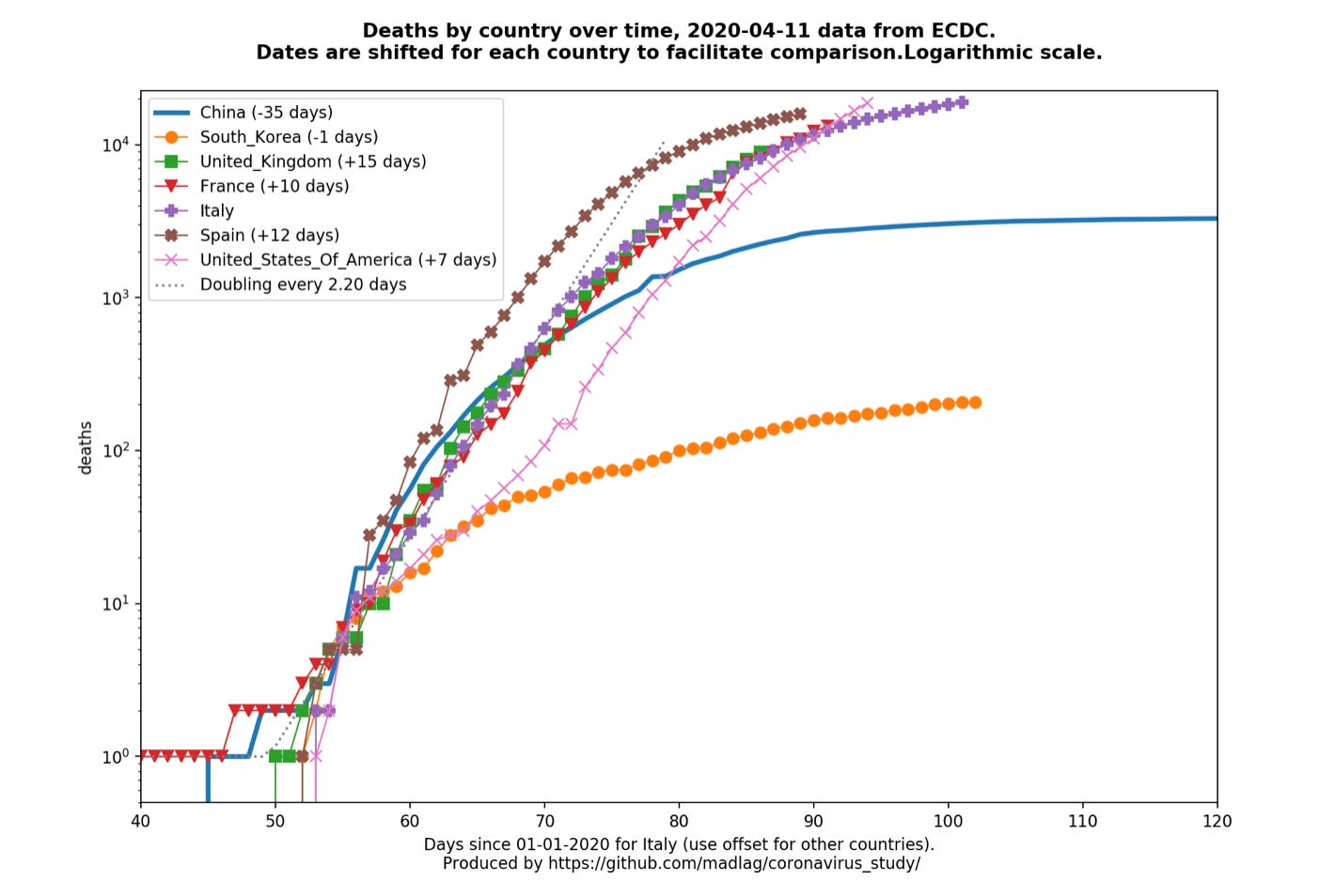
Death curves (updated daily as ECDC releases). Major update with per country graphs now available (Link)

A hopeful and powerful message from the German President in his Nation’s Easter address and the best links for everyday of this week.
Happy Easter.
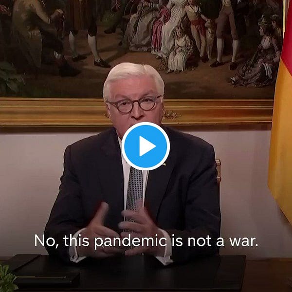
🇪🇺 Easter message: German President Frank-Walter Steinmeier. It is the first time a German president has addressed the nation outside the traditional Christmas address.
The German president made it count by decrying comparing the pandemic to a war and insisting instead that it was a “test for our humanity”. He urged patience and solidarity to come out stronger. (Link)


🥇The Best of this Week: Highlighting the best links for each day of the week with a link to the newsletter that day.
Monday: The Queen’s Speech (Link) in “A tough week ahead” (Link)
Tuesday: Five Thirty Eight’s article “Case counts are meaningless” (Link) in “Get Well Boris Johnson” (Link)
Wednesday: Dan Wang’s “Definitive Optimism as Human Capital” (Link) in “Humanity is our biggest Strength” (Link)
Thursday: Scott Gottlieb’s interview on CNBC SquawkBox (Link) in “Learning to fail, failing to learn” (Link)
Friday: Ezra Klein’s “I’ve read the plans to reopen the economy. They’re scary.” (Link) in “Waiting for the Vaccine”(Link)
Saturday: Germany’s healthcare capacity map showing the rest of the world how it is done (Link) in “Are the food banks coming?” (Link)
📊 A picture is worth a thousand words: Global (🌎) and local (with relevant flag) visualisation and forecasting tool
🌍
NEW❗️MRC Centre for Global Infectious Disease Analysis started to publish weekly death estimates for countries (Link)🇺🇸
NEW❗️The US Center for Disease Control and Surveillance (CDC) publishes “A Weekly Surveillance Summary of U.S. COVID-19 Activity” (Link)Google has published a new website to “See how your community is moving around differently due to COVID-19”. They have a lot of data to do so… (Link)
🌎The Financial Times has a data tracking page which is in front of the paywall, looking at cases and fatality curves for selective countries and metropolitan areas/region. It is not as extensive as the Madlag link below, where you can see static as well as animated images for a greater number of individual countries. (Link)🇺🇸/🌍The Institute for Health Metrics and Evaluation (IHME) is an independent global health research center at the University of Washington (UW). It has put out a simulation for the US (overall and by state) of what is the expected shortfall in health capacity (bed, ICU, ventilators) and when is the expected peak of the epidemic for each state. It has now added countries in the European Economic Area (EEA). A valuable resource. (Link)🇺🇸Another valuable resource by Unacast ( a data company providing human mobility insights). Their “Social distancing scoreboard looks and compares (State by State and County by County), the change in mobility to prior to COVID19 (Link)
🌎 Country by Country Curves: This is a GitHub made by my friend Francois Lagunas. He has written a script to scrape deaths and number of cases in order to visualise the rate of growth on a logarithmic scale. Great resource (Link)
CityMapper has started to produce City Mobility Index to show how much a City is moving. This is a very good indicator of how well lockdowns are respected around the world: Barcelona (4% of city moving) at one end and St Petersburg at the other end (68% of city moving) for yesterday (Link)
🌎A great resource put together by Ben Kuhn and Yuri Vishnevsky. At a time when we need solidarity and cooperation, I prefer their subtitle “We need stronger measures, much faster” than their title. It’s a simulator on what case growth looks like depending on your community’s measures. Fantastic resource to stir communities and governments to action (Link)
🇩🇪 The COVID19 dashboard for Germany is one of the best around. (Link)
🌎A helpful guide by VOX of the “9 coronavirus pandemic charts everyone should see” (Link)
🌎Data and chart regularly updated by the Centre for the Mathematical Modelling of Infectious Diseases at the London School of Hygiene & Tropical Medicine. It maps the effective reproduction number (also known as R0) of COVID19. You want to get it below 1 as fast as possible to contain an epidemic. (Link to see charts and more data about your country)
🌎This is a great COVID19 Dashboard prepared by Andrzej Leszkiewicz. Andrzej has also written an introductory and explanatory blog for it (“Coronavirus disease (COVID-19) fatality rate: WHO and media vs logic and mathematics”). I particularly like the country comparison tab, which allows you to track and benchmark the curve of the epidemic (number of cases and deaths) in your country with that of another. Very well done and informative. (Link)
“Going Critical” by Kevin Simler is a detailed interacting essay talking about complex systems, the importance of understanding networks, modelling and how this applies to: memes, infectious diseases, herd immunity, wildfire, neutrons and culture. Must read (Link)
🇸🇬/🌎 Singapore remains the gold standard of dashboard. Here is an article with the Best and Worst of all dashboard in the world, with Pros and Cons prepared by Neel V. Patel for MIT Technology (Article)
🏛 Notable tracking projects
💊“COVID-19 treatment and vaccine tracker”. This tracker contains an aggregation of publicly-available information from validated sourcesby the Milken Institute (Link)🏛Tariq Krim has started a COVID19 website tracking data about each government policy response to the pandemic (Link)
🏛Oxford COVID-19 Government Response Tracker (OxCGRT) was launched yesterday. Data is collected from public sources by a team of dozens of Oxford University students and staff from every part of the world. It also looks at stringency of the measures and plots stringency with case curves. A great initiative and resource (Link)
👩💻Mike Butcher (Editor at Large Techcrunch and founder of TechforUK), had refocused TechforUK on the fight against COVID19. It is a very effective hands-on team of volunteer. Do reach out to them. He has also teamed up with We are now working closely with the volunteers behind the “Coronavirus Tech Handbook”. (They are ‘cousins’ of ours who originally created the Electiontechhandbook). Volunteer collaboration at its best! (Link)
📰 Cronycle resource:
Cronycle has made available a number of open-access feeds on its website which I extensively use for the Corona Daily. The four first feeds are:
1. COVID-19 General (Link)
2. COVID-19 x Resilience (Link)
3. COVID-19 x HCQ/CQ (Link) (HydroxyChloroquine and Chloroquine)
4. Gig Economy x COVID-19 (Link)
And I have added a new feed below
5. Supply Chain x COVID-19 (Link)
I will write more in the future on how you can leverage Cronycle for keeping up to date in between two editions of this newsletter. (Link)
Here is a blog post from Valerie Pegon at Cronycle: “Grow knowledge about Covid-19, not anxiety!” (Link)
🎬 The Grant Sanderson permanent video corner:
Exponential growth and epidemics
This is an excellent video explaining “exponential growth” and epidemics. Although we are all familiar with the phrase, its authors rightly says that “yet human intuition has a hard time recognising what it means”. This is a ❗️MUST WATCH❗️to understand fully what is upon us but also how early behavioural changes at scale can have a massive impact on the level of exponential growth of COVID19 (Link)
“Simulating an Epidemic”
This is the second video by Grant Sanderson looking at simulating an epidemic under different physical distancing measures. (Link)


